YITH WooCommerce Multi-step Checkout Premium
$79.99 Original price was: $79.99.$3.50Current price is: $3.50.
Avoid overwhelming customers and reduce cart abandonment by making your checkout simple and neat
A/B split testing on checkout pages (analysis made to find out which checkout structure works better on e-commerce sites) has shown that a multi-step layout is the best option for a better user experience during the purchase process.
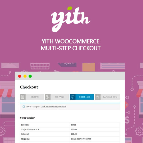
A multi-step structure helps customers feel more comfortable during the payment as they understand which step of the process they are in.
During the checkout, customers are generally required to add a lot of details on the same page and this process might seem long and confusing. In one word: overwhelming.
A multi-step checkout helps to sort data and split them into different sections displayed one after the other: this makes it much clearer from the customer’s point of view. It reduces the possibility of messing up information or making errors while filling in the forms. Cart abandonment and other common problems of websites with complex checkouts are greatly reduced.
Only logged in customers who have purchased this product may leave a review.
Related products
WordPress Plugins
WooCommerce
WooCommerce Plugins
Elementor
WooCommerce Plugins


Reviews
There are no reviews yet.